
The Tides Brentwood, completed April 1, 2017, multifamily mid-rise building at 1157 S. Bundy Drive, Los Angeles, CA
Our primary goal in designing this five story apartment building in Brentwood off Wilshire Boulevard was to engage the neighborhood and celebrate the iconoclastic spirit of Los Angeles. The block was a formerly drab and interstitial area lodged between bulky offices to the South and small homes to the East. The main North façade of Bundy Drive fronts a large open parking lot across the street, and the building’s prominent corner at the Bundy and Goshen intersection is a locus of stalled cars commuting in the morning and evening.

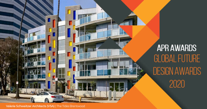
2nd Award- Global Future Design Awards 2020
Firm | Valerie Schweitzer Architects (VSA)
Architect/Designer | Valerie Schweitzer
Category | Housing Multi- Family
Team | Valerie Schweitzer Architects; Plus Architects
Country | United States
Photographer/Copyright | ©Dan Arnold, JWP studio
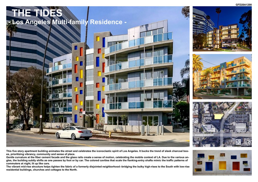
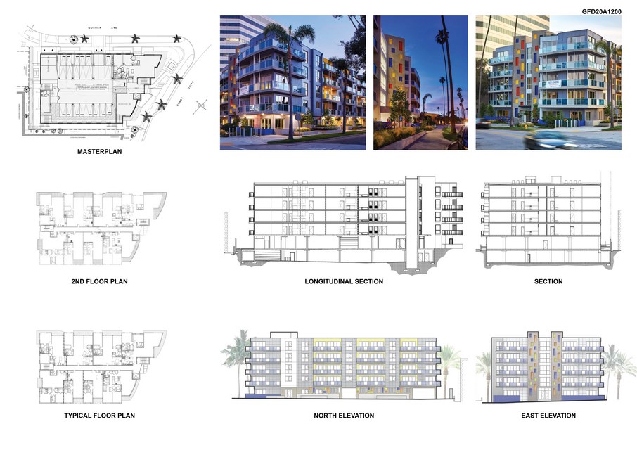
We deepened the sense of place by pooling of ecologies from around the site, specifically its nearby Pacific Ocean, 3.5 miles West, its predominant sunshine, and it lofty palm trees that border the site itself. We reflected these contextual elements in the two exposed North and East elevations. Firstly, subtly curved floor plates at the façade on Bundy, and at the glass rails, mimic the tidal currents of the ocean; so do the alternating frosted-white low-iron glass and deep blue-hued glass at the balcony rails. This assembly of undulating forms together with discrete vibrating colors of stucco, glass, fiber cement, and aluminum vertical struts, help to forge a dynamic connection between the street life and the structure. The Bundy façade seems to subtly shift and change form as one walks or rides past it, at any speed, generating a more animated street life.
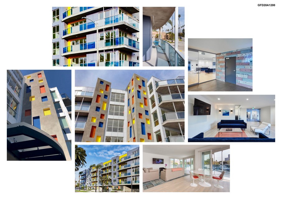
Pivoting between architecture and art, the facades push the boundaries of painterly potential. The Mondrian-inspired colored cavities that scale the entrance’s gray stucco-clad circulation shafts seem to vibrate chromatically especially at dusk. They also light up at night with LEDS, providing a luminous glow to those exiting the Supermarket at night.
In a playful riff, these multi-colored rectangles also mimic the traffic patterns and nocturnal lights of commuters, connecting the horizontal street life with the vertical circulation routes of the inhabitants. Forging further engagement with the street are the ample balcony spaces that expand the interior with their large 4-panel sliding doors, and give a sense of enclosure, due to the addition of vertical aluminum posts that span from the rail to the underside of the deck above. Vinyl doors met the budget restraints while also providing greater insulation.
Color was our tool to provide a sense of drama and place, while remaining within the budget. The empty rectangular spaces created by aluminum struts correspond with the rectangular niches of saturated stucco, thereby linking in in our minds hollow spaces and color. In this way, color is used inventively, as a truly architectural element and not just a coating—it helps sculpt space.
The quieter Goshen façade couples oceanic blue-gray fiber cement, a low- maintenance sustainable cladding material, with bold sunshine yellow. Ample glass reflects the site’s mature palm trees. A similar palette of color is re-introduced in the coffered ceiling of the hallways and the lobby’s lounge.
Finally, a living wall at the rear courtyard reintroduces the same colored cavities, only here they are deepened, to provide seats for loungers and habitats for plants.