
Hector Guimard trained as an architect in the Beaux-Arts tradition known predominantly for his Metro entrances. However, his aptitude in the worlds of decorative arts, graphic design, and related disciplines brought him into the center of Parisian culture and the Art Nouveau style.
Global Future Design Awards 2024: Entries Open!
Take your work to the next level. Register Now…

Silver 🏆 Winner
Global Future Design Awards 2023
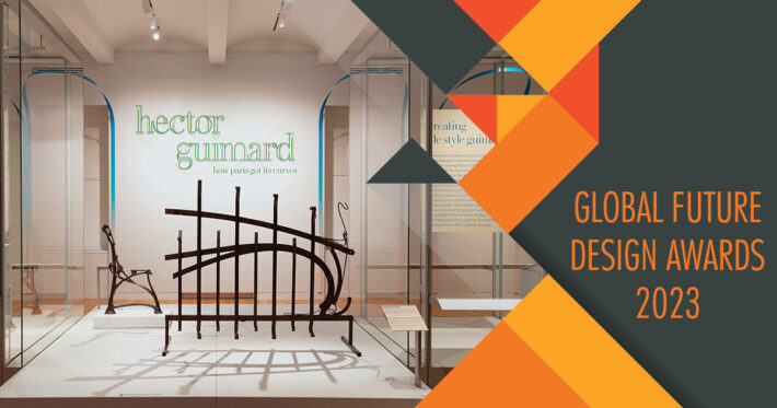
Cooper Hewitt Guimard
Interior Design (Built)
Firm
Studio Joseph
Architect/Designer
Wendy Evans Joseph
Design Team
Wendy Evans Joseph, Monica Coghlan, Jose Luis Vidalon, Sharon Li, Sean Barbe, Brandon Studer
Project Location
Cooper Hewitt, Smithsonian Design Museum
Country
United States
Photographer/Copyright
©Matt Flynn
Social Media Handles
Facebook: N/A
YouTube: N/A
Instagram: N/A
Twitter: N/A
Website URL
N/A
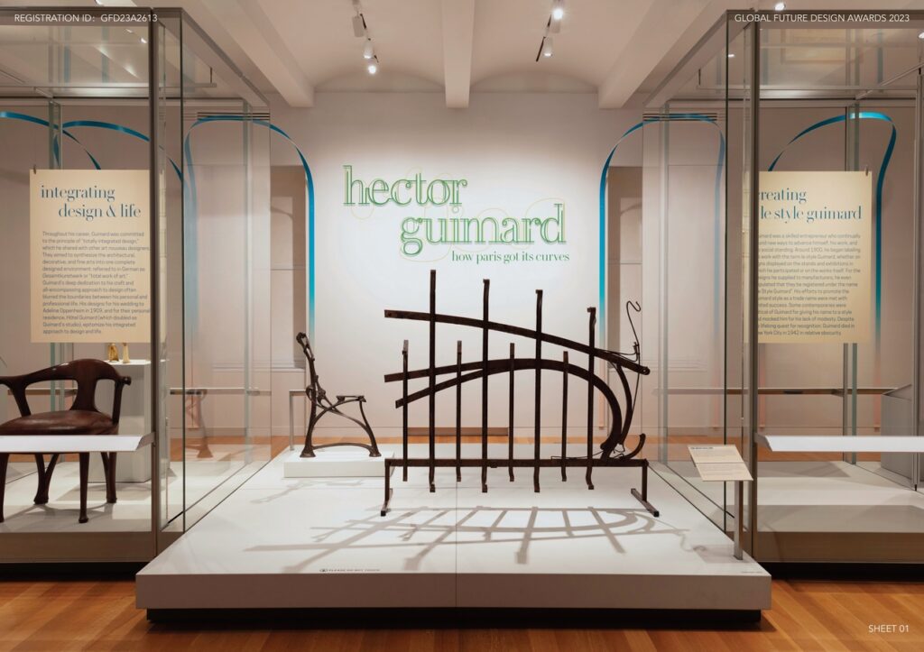
This exhibition at the Cooper Hewitt Smithsonian Design Museum brings to life the full range of his artistic vision, elevating the work by giving the visitor a proper understanding of the cultural context and the times in which he worked. Respecting Guimard’s style and working process, the installation is both backdrop and muse. The graphics and armature play with organic forms but are intentionally not derivative. The design addresses the inherent challenges of the existing, large-scale glass casework directly, with legible, consistent graphics that maintain a sympathetic color palette of cream background with blue and green as highlights.
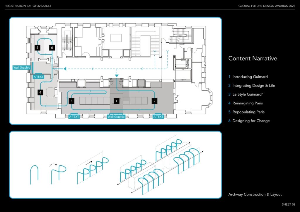
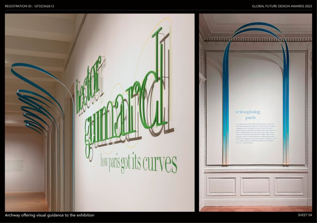
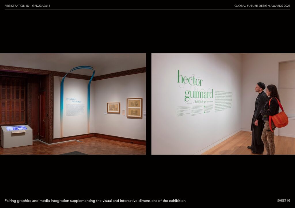
The design has a simple gestural architectural motif that works with a carefully curated graphic identity. It feels contemporary while employing subtle nods to the historic design objects found within the exhibition itself. Created from 1/8″ thick “Sintra,” looping single strands twist from their attachment so that the arches remain upright when wall-mounted. This simple but dynamic movement generates a form with structural integrity, requiring no attachment to the ceiling. Our method was to print large sheets with a color gradient and then slice the sheet into individual strand. Despite the thinness of the material, the looping gesture itself maintains the arch form. This single, very economical gesture ensured a strong character for a show with very modest resources. The arches delineate a path of travel or frame the section text panels in each gallery.
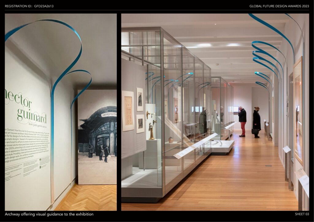
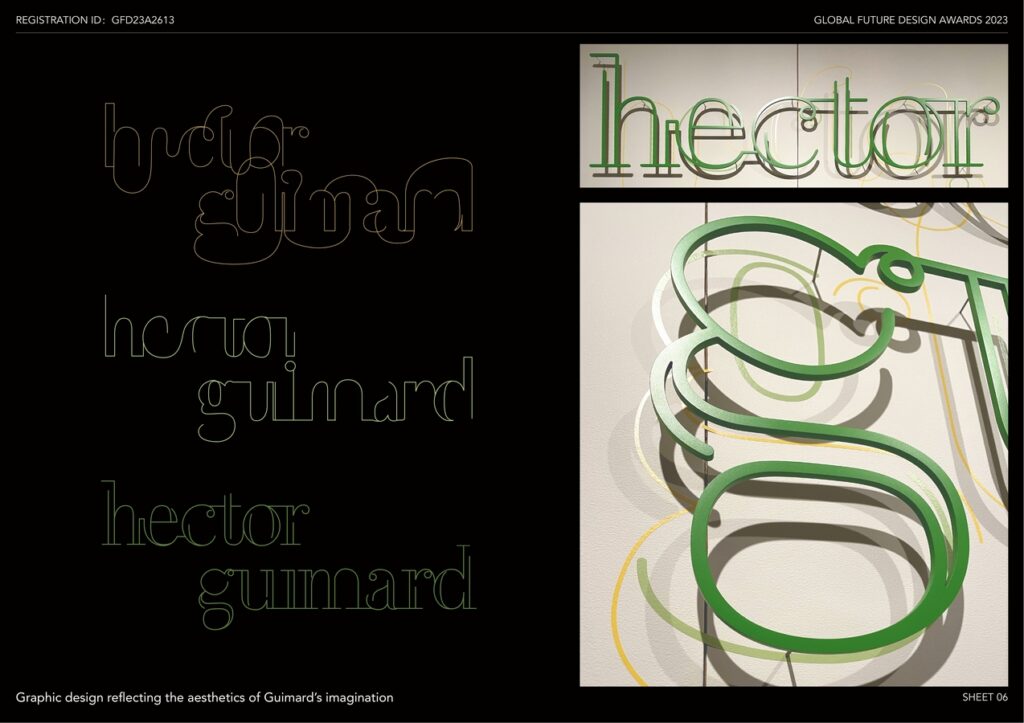
Given Guimard’s prowess in the field of graphic design, we thought carefully about the meaning behind font choices, palette, and physical design strategy. The titling for the exhibition is set in “Le Jeune Poster,” a modern adaptation of “French Modern” popularized by the Didot family. By setting titles in all lowercase, the shape of the French letterforms reference and align visually with the curved forms of the spatial installation.
The flowing, searching lines for the introduction title graphic found inspiration in the movement of Guimard’s sketches. A 3-dimensional version of the title serves as the introductory statement to the show. The fabrication has two parts—a flat graphic underlayer in green and yellow and a floating top layer made of laser-cut aluminum letters. This implementation, strengthened by shadows, reinforces the integrity of the exhibition identity by evoking the sculptural qualities of Guimard’s architectural vocabulary.
The colors that make up the two-tone gradient are used throughout the exhibition and serve multiple functions. The blues and greens breathe life into the galleries by introducing a playful spirit and vibrant throughline. The cream color works with the colored paper used in Guimard’s sketches and the sepia-toned photography. Color creates visual cohesion between different elements and provides opportunities to highlight critical moments of the curatorial narrative.